Sunday, May 23, 2010

Week 8: Cartography & Geovisualizaton

A massive fire broke out in Los Angeles National Forest on August 26, 2009. The fire was dubbed the “Station Fire” by the media because of its proximity to Mount Wilson, on top of which sits radio and television transmission towers.

Firefighters were able to completely contain the blaze October 16. The fire burned a total of 160,000 acres, the 10th largest in California state history (CDFFP). Mostly fires in S. California are grassland fires,but the Station Fire was a true forest fire, as it burned primarily in the wooded hills of the Los Angeles National Forest (InciWeb). The flames threatened many homes in neighborhoods like La Canada, Flintridge, and Glendale (St. Fire info). 10,000 homes were evacuated as a precaution (CNN). In total, 64 structures were destroyed by the fire, and two firefighters were killed(St. Fire info).
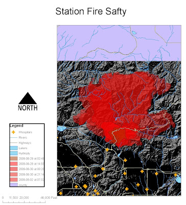


In the first map I aimed to show the spread of the fire from 45,000 acres to 160,000 acres in a few days. I displayed the lakes and rivers of the near-by area in hopes of displaying the possibilities of firefighters using this recourse to put-out the fire. I wanted to show how the rivers were unfortunately not able to contain the fires from spreading in that large over-growth area. Due to the fact that firefighters use helicopters to suck-up water to try and “rain-down” on the fire, I displayed the lakes in that area. A large water source is necessary to fuel these helicopters for easy and safe pick-up. I also displayed the large highways and hospitals in the area. This shows that there are not any roads that are contained within the fire, but if the fire were to go south, there are hospitals that could be used to treat near-by residents.
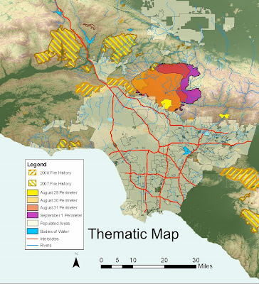


My aim with this map was to show areas of high risk of fire in Los Angeles. I showed the spread of the fire, with the vegetation of the area as well as the County of Los Angeles. The Station Fire broke out in an area where no fires had been for the past two years; there was no fire in the thickly-wooded Angeles National Forest for 62 years (CNN). The fire burned so quickly that it could not be contained. We can see that fires occur in rural areas and are contained before they reach the urbanized floor of the Los Angeles basin. Due to the tendency of fire to burn more efficiently uphill rather that downhill, the people of Los Angeles were very lucky to be below the burn. I also put past fire history to show that they have not recently reached to city, but also begs the question as to whether our policy should shift from containment to letting small fires happen naturally to prevent future large-scale burns.

I believe that my projections of the Station Fire shows the problems with our current fire-control policy in California. Due to the hard-blowing hot Santa Ana winds, the Los Angeles area is always going to be prone to fires. Although the cause of the fire is believed to be arson, better fire-protection is necessary. We need to control the amount of brush in the mountainous areas. This can be done naturally, by allowing fires to happen naturally so that there are often small-scale fires that will allow forest areas to relieve itself of the dead brush naturally; or the manually remove the brush with human intervention. I believe that policy that combines both methods will be the most effective.

Sites:

CAL FIRE

Inciweb

Station fire info

KTLA

Tuesday, May 18, 2010

Week 7


West_Bounding_Coordinate:-119.03249999967
East_Bounding_Coordinate:-118.19916666628
North_Bounding_Coordinate:37.5922222215345
South_Bounding_Coordinate:36.9974999992722
Spatial Reference: GCS North American 1983
Datum: D North American 1983

This is an area of the California mountains. I believe this is an area that is not very populated. I tried, and succeeded, to capture an area in America that has both a strong mountain range and deep valley to show strong topography lines. California rules when it comes to creating maps.

Wednesday, May 12, 2010

Week 6: Projections in ArcGIS


Map projections are important in GIS because they project geographic data clearly. Even though the Earth is a 3D object, we still must project in 2D form many times. But this causes problems because all map projections introduce some sort of mathematical distortion from shape to area to distance or direction. We must know how certain map projections distort our globe and how to use the preserved state of the projection for our benefit because depending on the purpose of the map, some distortions are acceptable and others are not.

Equal Area maps preserve, you guessed it, the area. The Bonne projection is a pseudo-conic projection. It has segmented meridians and the meridians bend at the equator. The parallels are plotted as concentric, equally spaced circular arcs. It is particularly well suited to regional and continental mapping, but shape distortion around the edges limits its use in global maps. In the Cylindrical Equal Area map with straight parallels and meridian but appear to be stretched North-South near the equator and stretched East-West near the poles. Even with this distortion it is one of the more practical for online mapping and supported by ESRI.

Equidistant Map projections aim to maintain distance. for the Conic Equidistant map the meridians are straight equidistant lines, converging at the North Pole. "Compared with the sphere, angular distance between meridians is always reduced by a fixed factor, the cone constant." Parallels are arcs of circle, concentric in the point of convergence of meridians. But the consequence of this is that parallels cross all meridians at right angles meaning distortion is constant along each parallel. In a Equidistant Cylindrical projection all the meridians have a constant scale that are equal to the standard parallels's, so all parallels are equally spaced. It is still commonly used in digitized textures ("skins") of earthly and planetary features.

Conformal map projections preserve angles locally. The Sinusoidal prjection retains property of equivalence of area. Areas on a map are proportional to same areas on the Earth. "Distances are correct along all parallels and the central meridian(s). Shapes are increasingly distorted away from the central meridian(s) and near the poles." But because of this, a Sinusoidal projection map is not perspective or equidistant.The Eckert VI projection is used for maps of the world. It is pseudocylindrical and equal area. "The central meridian and all parallels are at right angles, all other meridians are sinusoidal curves." There is an increase of shape distortion at the poles but the scale is correct at standard parallels of 49:16 North and South.

Map projections rule, but probably not as much as my TA: Erin Streff, middle name Elizabeth.

Wednesday, May 5, 2010

Week 6 ArcGIS


ArcGIS is a very powerful tool in the right hands. I found the tutorial to be very detailed and well organized. I found myself able to retain the information later in the tutorial from previous lessons. The main purpose of ArcGIS is to visually display thousands of pieces of information compiled in tables in the form of a map. Although it was a very time consuming operation, I feel as though I gained a vast amount of knowledge that could not be taught in a class room. Theory on GIS is helpful, but the step-by-step guide really allows you to get in there and get your hands dirty with the program.

Just from doing this simple tutorial you realize the potential ArcGIS can have. With all the layers of information, you can a seemingly endless amount of comparable data on one visual map. the problem is, entering all that data manually can be exponentially tedious and time-consuming compared to working with the data. Unless you have a team of grad students working for you as slave-labor, it could take years to enter the amount of data you need. This is where the Arc Catalog comes in to save the day. The Arc Catalog has tons of information stored as a geodatabase. But it would seem to me that the most valuable information, is new information that is not available from the public. Publis information may be plentiful, but it also may not be accurate.

I tried to operate ArcGIS remotely, but it was too slow. I'm not sure if this was due to the internet connection, or the fact that ArcGIS may be a large program that requires a lot of computer resources. Because of this I did all my work in the lab, which I think helped me out by forcing me to take my time and work deleteriously.

I could see ArcGIS as a very powerful tool for a city planner. You could lay out an entire city "on paper" and keep in fully manageable down to the last detail. With the layering of ArcGIS, you can have buildings, streets, sewers, topography, and climate all on the sheet; then you just select which layers you would like to appear and you have a map you can work with. But, to me, the most powerful tool if ArcGIS, is the ability to update that information. In todays world we need up-to-the-second information and ArcGIS can allow this. This is how websites can operate that show you the climate over the entire globe or fires in certain regions, by haveing constantly updated information made possible by ArcGIS software.

Erin is the best TA. Let's get a 10/10 on this one instead of any 9.7/10!!