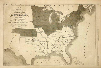
This is a map of the Confederate States during the American Civil War in 1891. This map was from Harper's Weekly which during its most influential period it was the forum of the political cartoonist Thomas Nast. The map shows the "man made" boundaries of each state as well as their capital cities. The Union States have been darkened to differentiate them from the Confederate States. Bodies of water have also been labeled. there is no compass rose so the top is assumed North, There is also nothing that shows scale or distance. I find this map to interesting because the Civil War was a very controversial time in our history, and if you were living during that time, a map showing which states were leaving the Union could either raise or lower your confidence in your government. It is also interesting to see that there is no representation of the western part of the continent which was actually fairly influential in funding the Union's war effort.
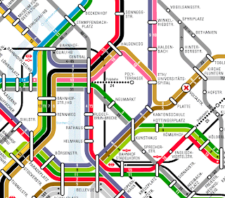
 This is a tram map from The Pervasive 2002 conference website that was held at the Federal Institute of Technology in Zurich Switzerland. This map shows the above ground tram system that will be used to get the the conference. At first glance the map seems very confusing, but if you study it for a minute you can get a fairly coherent layout of the city. There are many tram lines, but what is interesting to me is that you could take several different tram routs to arrive at the same place. I chose this map because it shows how in our world today it is so easy to give information on how to arrive at a gathering by just posting a map and directions on a familiar website. I also found it interesting that this tram system runs 24 hours a day.
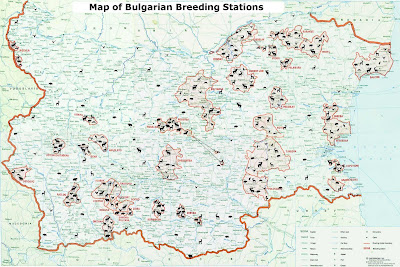
It is a little bit diffic
 ult to see, but this map shows the breeding sites if the local fauna in Bulgaria by Cartogrphia Ltd. The sites are represented pictorially by the animals they represent, as well as an outline in red with a light-red coloring of the area it covers. There is a Key in the bottom right corner that identifies the the text on the map to show you if it is a city, town, etc. The map is very detailed, but it is strange that there is no representation of a scale. I choose this map to show that not all maps are for representing patterns of human life. I also like how it combines a familiar map ( cites, capitals, airports) to give you a sense of familiarity with the animal habitat characteristics (Habitat, caves, fields).

I like the variation in scale and type of maps you posted. The breeding map is especially interesting. I wish it showed the what each of the animal symbols meant.
ReplyDelete10/10