Wednesday, April 21, 2010
week 3
View Brazil Trip in a larger map
The Mash-up map that I created is the large scale route I took to get from Los Angeles to various cities in Brazil and back during my most recent Winter Break along with some commentary at each stop.
Neogeography has both it's benefits and pitfalls. Because it is so easy to create your own personal map on websites such as Google Maps, anyone with an internet connection can create and make public a map. This allows us, as users, to be connected to a plethora of information about almost location in the world at the click of a mouse. This is great if you want to share with friends and family a travel itinerary of your recent vacation with pictures and video each stop or post some of your favorite local hot-spots for the community. But because there is no one to monitor the millions of maps created, we don't know if the information posted by the public is accurate. It is commonly believed that there is no such thing as too much information, but if that information is unreliable, it can't be trusted in either the scientific of social community. This is probably why dynamic maps are not nearly as popular as other online social-mediums, because they are based so much on opinion and lack regulation.
Friday, April 9, 2010
Week 2
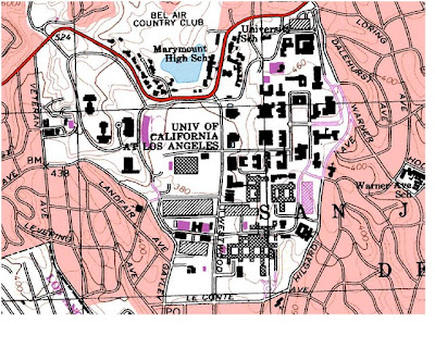
1. Beverly Hills Quadrangle
2. Canoga Park, Van Nuys, Burbank, Topanga, Hollywood, Venice, Inglewood
3. 1966
4. Horizontal: NAD 1927; Vertical NAD 1983.
5. 1: 24 000
6.
a. 1/24,000 = 5cm/D D= 24,000 x 5 cm 120,000cm= 1200m
b. D= 5 in.* 24,000 = 120000 in. 1mi/63360in * 120000in. = 1.89mi.
c. 1/24000 =D/1mi. D = 1/24000 = 4.166*10^-5mi. 63360in./1mi * 4.166*10^-5= 2.64 in.
d. 1/24,000 = D/3km. D= 1.25*10^-4km. 100000cm/1km * 1.25*10^-4km = 12.5cm
7. 20 feet
8. geographic coordinates
a. The Public Affairs Building: 34° 4’ 12” N, 118° 26’ 15” W; 34.07 N, 118.4375 W
b. Santa Monica Pier: 34° 0’ 40” N, 118° 30’ W; 34.01 N, 118.5 W
c. Franklin Cyn Reservoir: 34° 6’ N, 118° 24’ 30” W; 34.1 N, 118.408333 W
9. elevation
a. Greystone Mansion: 550 ft, 167.64 m
b. Woodland Cemetery: 140 ft, 42.67 m
c. Crestwood Hills Park: 600 ft, 182.88 m
10. UTM Zone 11
11. 37 63; 3 62
12. 1,000,000 m2
13.
14. Magnetic declination: 14° East
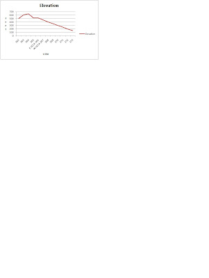
15. It’s flowing southward because the elevations “crossing the river” get smaller toward South.
16.
2. Canoga Park, Van Nuys, Burbank, Topanga, Hollywood, Venice, Inglewood
3. 1966
4. Horizontal: NAD 1927; Vertical NAD 1983.
5. 1: 24 000
6.
a. 1/24,000 = 5cm/D D= 24,000 x 5 cm 120,000cm= 1200m
b. D= 5 in.* 24,000 = 120000 in. 1mi/63360in * 120000in. = 1.89mi.
c. 1/24000 =D/1mi. D = 1/24000 = 4.166*10^-5mi. 63360in./1mi * 4.166*10^-5= 2.64 in.
d. 1/24,000 = D/3km. D= 1.25*10^-4km. 100000cm/1km * 1.25*10^-4km = 12.5cm
7. 20 feet
8. geographic coordinates
a. The Public Affairs Building: 34° 4’ 12” N, 118° 26’ 15” W; 34.07 N, 118.4375 W
b. Santa Monica Pier: 34° 0’ 40” N, 118° 30’ W; 34.01 N, 118.5 W
c. Franklin Cyn Reservoir: 34° 6’ N, 118° 24’ 30” W; 34.1 N, 118.408333 W
9. elevation
a. Greystone Mansion: 550 ft, 167.64 m
b. Woodland Cemetery: 140 ft, 42.67 m
c. Crestwood Hills Park: 600 ft, 182.88 m
10. UTM Zone 11
11. 37 63; 3 62
12. 1,000,000 m2
13.

14. Magnetic declination: 14° East
15. It’s flowing southward because the elevations “crossing the river” get smaller toward South.
16.

Thursday, April 1, 2010
Week 1 Maps

This is a map of the Confederate States during the American Civil War in 1891. This map was from Harper's Weekly which during its most influential period it was the forum of the political cartoonist Thomas Nast. The map shows the "man made" boundaries of each state as well as their capital cities. The Union States have been darkened to differentiate them from the Confederate States. Bodies of water have also been labeled. there is no compass rose so the top is assumed North, There is also nothing that shows scale or distance. I find this map to interesting because the Civil War was a very controversial time in our history, and if you were living during that time, a map showing which states were leaving the Union could either raise or lower your confidence in your government. It is also interesting to see that there is no representation of the western part of the continent which was actually fairly influential in funding the Union's war effort.
 This is a tram map from The Pervasive 2002 conference website that was held at the Federal Institute of Technology in Zurich Switzerland. This map shows the above ground tram system that will be used to get the the conference. At first glance the map seems very confusing, but if you study it for a minute you can get a fairly coherent layout of the city. There are many tram lines, but what is interesting to me is that you could take several different tram routs to arrive at the same place. I chose this map because it shows how in our world today it is so easy to give information on how to arrive at a gathering by just posting a map and directions on a familiar website. I also found it interesting that this tram system runs 24 hours a day.
It is a little bit diffic
 ult to see, but this map shows the breeding sites if the local fauna in Bulgaria by Cartogrphia Ltd. The sites are represented pictorially by the animals they represent, as well as an outline in red with a light-red coloring of the area it covers. There is a Key in the bottom right corner that identifies the the text on the map to show you if it is a city, town, etc. The map is very detailed, but it is strange that there is no representation of a scale. I choose this map to show that not all maps are for representing patterns of human life. I also like how it combines a familiar map ( cites, capitals, airports) to give you a sense of familiarity with the animal habitat characteristics (Habitat, caves, fields).

Subscribe to:
Comments (Atom)